
When To Use A Fishbone Diagram … And Why You Should Do It More Often Than You Think
By Ben Locwin, Ph.D.
 Part 2 of Identifying And Resolving Errors, Defects, And Problems Within Your Organization — a five-part series on operationalizing proper improvement techniques
The previous article in this series was focused on identifying manufacturing trends so you can know when to act and when to let your processes run without interference. This is a critical distinction.
Now we’ll discuss what needs to happen when a defect or nonconformance is detected and it needs to be investigated. To do this, I’ll explain one of the most broadly applicable and durable root cause analysis tools to investigate the quality of your manufacturing processes: the fishbone diagram.
You may think you know fishbone diagrams, but not to the level that I’ll cover here. You’ll more than double your finesse with this tool* — so let’s get to it.
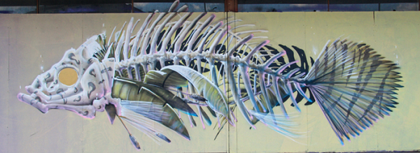
Ceci n’est pas un poisson.**
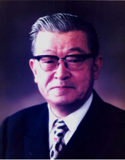
Kaoru Ishikawa’s Most Memorable Scribble
Before 1960, there were no conversations about the fishbone diagram, its utility, or whether people were using it properly. This is because it didn’t exist prior to that. Instead, it began its existence humbly at that point as a scribble on Kaoru Ishikawa’s notepaper.
“I popularized the fishbone diagram… What have you done today?”
Ishikawa was an engineer working at the University of Tokyo as well as with the Japanese Union of Scientists and Engineers. Eventually, he began to elaborate on an annotation idea that he had – showing branched causality between problem antecedents and an identified effect. This wasn’t the first attempt of its kind, but it was the most structured.
The simple branches that he began to work with were from major causal factor categories, such as types of equipment and machinery, then anything that personnel may have been associated with (or if there were issues that could have been prevented by personnel), and finally extending to the facility itself (i.e., were there any deficiencies in the facility that could have led to an identified problem?).
This thought process eventually wound up manifesting as the crude beginnings of what we call the fishbone diagram. It was also called the cause and effect diagram, for its representation of problem causal factors and their ultimate effect. Many famous examples of fishbone diagrams exist, including ones at Aston Martin and for the development of the Mazda Miata.
It is also referred to as the Ishikawa diagram, though that’s a much more rare linguistic usage than fishbone diagram.
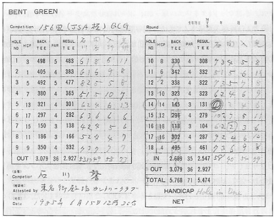
Ishikawa also liked golf … probably because it allowed him to annotate in tabular format.
The Fishbone Diagram And How To Use One Like A Pro
There isn’t one flavor of a fishbone diagram that you’ll see with 100 percent certainty across all organizations. The most comprehensive and simple version includes what are called the “6M Categories”: Man, Material, Method, Measurement, Machine, and Mother Nature. When drawn on a flipchart or whiteboard, etc., here’s what it looks like:
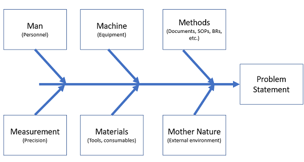
So again, the diagram gets its name because if you suspend disbelief briefly, it looks like the skeleton of a rib-impoverished fish. It’s hard to go below about six major categories, lest you begin to compromise your ability to do good detective work. I’ve seen some versions of these with four or five Ms, but they didn’t provide good resolution into multifactorial issues, and they were crafted by someone who didn’t know what they were doing.
Another format of the fishbone diagram that may help you in your work is one that I call “Fishbone By Process Step,” and it looks like this:
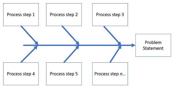
As the name suggests, this format uses the subordinate steps within a process to frame the categories that help the investigators exhaustively identify causal factors. So instead of framing the thinking of the user by the 6M categories (i.e., what could have gone wrong within our methods [documents] that may have contributed to the defect?), the problem-solving team can look at the process itself and ask: “What happens during step 2 of the process that could have allowed this effect to occur?” You could begin by taking out the offending SOP, flipping to the section that has a process map in it like this:
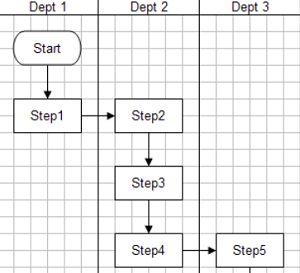
…and build the fishbone diagram from there in a stepwise fashion.
I’ve used this approach with incredible success for many, many years, and it can help you in certain cases as well.
Don’t Fall Into Common Fishbone Traps
As the saying goes:
Though this proverb was intended to refer to leadership, it’s apropos here as well.
More fishbone diagrams have failed their purpose for one reason over all others: an improperly or imprecisely (or both) defined and documented problem statement (which exists on the diagram at the “head” of the fish).
I want your problem statement to be replete with correlative data and information to the best of your ability to do so.
So instead of:
Leak identified on bioreactor
Do this:
…at 12:18 on 15Oct18 a leak was identified by [name] on the nth supplement port of manifold 3B during the inoculation procedure (BR-0038).
From here I could determine:
- how far into the inoculation it occurred (e.g., 12 minutes into the process, which may point me in a different causal direction than if it happened immediately upon opening an additive valve)
- which personnel and shift were involved (to be able to gather immediate real-time information relevant to the activities of the process)
- how often you have issues with this process step in this particular batch record, whether this particular piece of equipment (supplement port) has been implicated in other similar issues in the past
- and many other pieces of vital information.
Note the power of a well-specified problem statement. Remember, the point of these tools is that you should be brainstorming with experts in a co-located space, and presumably everyone is looking at the board/flipchart together. If you jot down a glib problem statement that is imprecise, you will tacitly psychologically encourage the participants in the room to frame their thoughts around that (poorly-written) problem statement. This is the power — and the danger — of groupthink.
Pro tip: If you craft your own version of a fishbone diagram, decide to eschew the 6M categories, and are wondering how to identify all the potential categories, ask yourself “What are the major themes that have an input or influence on how this process operates or goes wrong?”
After about eight to 10 categories, a fishbone diagram begins to get unwieldy and cumbersome (regardless of paper size), but you can begin to populate the categories with input from your subject matter experts (SMEs), and if any of the supernumerary categories have nothing within them, you can eliminate them later.
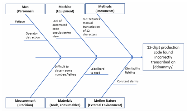
Case example: For further detail, in a previous article, I used a fishbone diagram on a fictitious example as follows:
Check here to find out more about that particular issue.
In Conclusion
However you choose to use it, the fishbone diagram is an enormously powerful tool of quality. In fact, if you think you’re “doing” quality and you’re not using one of the tools of quality (such as the fishbone diagram), you’re not actually doing quality at all. Used consistently and frequently, the fishbone diagram can help you identify root causes of issues (not just causal factors) and develop CAPAs to eliminate those problems. In fact, Ishikawa himself said that “standardization” and “quality control” were “two wheels of the same cart.” This applies to the pursuit of quality as well — if you don’t have rigorous standards for how you apply quality practices, including during investigations for improvements, you’re missing out on control of quality.
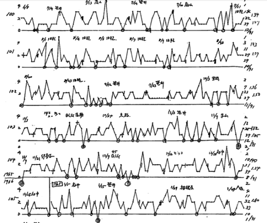
Think you can’t control your process using tools of quality, or that your processes are too idiosyncratic? Guess again. Above is how Ishikawa managed his golf scores, in QC chart format.
The next article in this series focuses on the concepts and practice of using fault tree analysis (FTA), empirically one of the most effective problem-solving tools in existence.
Notes:
*(+/- 99%). Reading this certainly can’t take away any knowledge you had about the FBD, but I’m guessing at the probability of broad readership knowing of its history and nuance to this level at about .0001%.
**Just as with René Magritte’s famous painting The Treachery of Images, this is not a fish skeleton, but a picture of a fish skeleton.
About The Author:
 Ben Locwin, Ph.D., MBA, MS, MBB, is a pharma executive and a member of several advisory boards and boards of directors across the industry and was the former president of a healthcare and pharma consulting organization. He created many of the frameworks for risk management and advanced process improvement currently in use within the industry and has worked across the drug life cycle from early phase to commercial manufacturing and marketing (GLP, GCP, GVP, GMP). He frequently keynotes events and conferences on these current topics. Connect with him on LinkedIn and/or Twitter.